

The period between 1988 and 2008 witnessed the first decline in global income inequality since the Industrial Revolution, reports Branko Milanovic of the World Bank. This trend, however, was driven by a decline in inequality between countries and can only be sustained if inequality within countries is kept in check.
There are three methods for calculating global inequality.
Concept 1. When we calculate this concept of inequality, we take all countries with their mean incomes –we have some 150 countries in the world with such data- and calculate the Gini coefficient. China and Luxembourg have the same importance, because we do not take population sizes into account.
Concept 2. Calculate mean income inequality but take population size into account
Concept 3. Calculate inequality of individuals based on actual income of individuals.
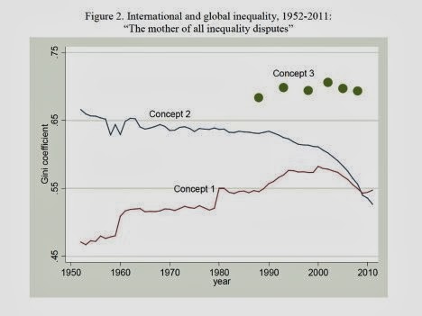
Inequality 3 can be calculated, as mentioned before, only from the mid-1980s because we do not have household surveys going further back in time. Figure 2 shows that Inequality 3 is higher than Inequality 2. This is true by definition because in Inequality 3 people enter the calculations with their actual incomes, not with country averages. A quick glance at Figure 1 shows that the variability of heights is greater in the third row than in the second. Averaging-out reduces measured inequality.
To calculate “true” global inequality or Concept 3 inequality, we have to adjust people’s incomes with the price levels they face and which, of course, differ between countries. We are interested in real welfare of people and those living in “cheaper” countries will get a boost in their incomes compared to what they make in nominal dollar terms. The currency we use is international (or “PPP” for purchasing power parity) dollar with which, in principle, one can buy the same amount of goods and services in any country of the world. Indeed, if we were not to adjust for the differences in price levels, and were to use nominal dollars, global inequality would have been even higher. This is because price levels tend to be lower in poorer countries, and income of people living in poorer countries thus gets a significant “boost” when we use PPP dollars.
Global inequality is calculated at approximately five-year intervals, from 1988 (the first dot on the left) to 2008 (the dot on the right). If we compare this last dot with a couple of dots for the earlier years, we see something that may be historically important: perhaps for the first time since the Industrial Revolution, there may be a decline in global inequality.[3] Between 2002 and 2008, global Gini decreased by 1.4 points. We must not rush to conclude that what we see in the most recent years represents a real or irreversible decline, or a new trend, since we do not know if the decline of global inequality will continue in the next decades. It is so far just a tiny drop, a kink in the trend, but is indeed a hopeful sign. For the first time in almost two hundred years—after a long period during which global inequality rose and then reached a very high plateau—it may be setting onto a downward path.
The main reason for this break in the previous trend is what also underlies the decrease in Concept 2 inequality: fast growth of relatively poor and very populous countries, most notably China and India. Their growth, reflected in the rising real incomes of their populations, has not only curbed the rise in global inequality, but pushed it slightly down. China’s and India’s roles stand in marked contrast to the two other factors that influence global inequality and which have both been clearly pro-inequality. The first is the divergence of countries’ mean incomes which lasted from around 1980 to 2000; the second were rising within-national inequalities in many countries. The catching-up of poor and large countries has been the sole factor offsetting these upward pressures. But it has been such a strong factor that it has either kept global inequality from rising or, more recently with the acceleration of Indian growth, reduced it.
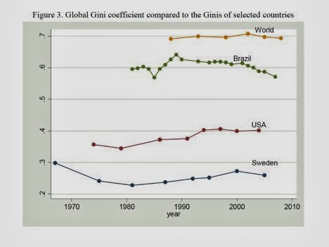
What can we say about the level of global inequality? What does the Gini of about 70, which is the value of global inequality, mean? One way to look at it is to take the whole income of the world and divide it into two halves: the richest 8% will take one-half and the other 92% of the population will take another half. So, it is a 92-8 world. Applying the same type of division to the US income, the numbers are 78 and 22. Or using Germany, the numbers are 71 and 29. Another way to look at it is to compare what percentage of world population, ranked from the poorest to the richest, is needed to get to the cumulative one-fifths of global income. Three-quarters of (the poorer) world population are needed to get to the first 1/5th of total income, but only 1.7% of those at the top suffice to get to the last one-fifth. Global inequality is much greater than inequality within any individual country. In Figure 3, global Gini of 70 is shown together with the Ginis for several countries. Global inequality is substantially greater than inequality in Brazil, a country that is often held, despite the recent improvements under the Lula presidency, as an exemplar of excessive inequality. And it is almost twice as great as inequality in the United States.
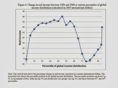
Change in Real Income Between 1988 and 2008 at Various Percentiles of Global Income Distribution (Calculated in 2005 International Dollars)
But the biggest losers (other than the very poorest 5%), or at least the “non-winners,” of globalization were those between the 75th and 90th percentiles of the global income distribution whose real income gains were essentially nil. These people, who may be called a global upper-middle class, include many from former Communist countries and Latin America, as well as those citizens of rich countries whose incomes stagnated. Global income distribution has thus changed in a remarkable way. It was probably the profoundest global reshuffle of people’s economic positions since the Industrial revolution. Broadly speaking, the bottom third, with the exception of the very poorest, became significantly better-off, and many of the people there escaped absolute poverty. The middle third or more became much richer, seeing their real incomes rise by approximately 3% per capita annually.
The most interesting developments, though, happened among the top quartile: the top 1%, and somewhat less so the top 5%, gained significantly, while the next 20% either gained very little or faced stagnant real incomes. This created polarization among the richest quartile of world population, allowing the top 1% to pull ahead of the other rich and to reaffirm in fact — and even more so in public perception — its preponderant role as winners of globalization.
Who are the people in the global top 1%? Despite its name, it is a less “exclusive” club than the US top 1 percent: the global top 1% consists of more than 60 million people, the US top 1% of only 3 million. Thus, among the global top percent, we find the richest 12 percent of Americans (more than 30 million people) and between 3 and 6 percent of the richest Britons, Japanese, Germans, and French. It is a “club” still overwhelmingly composed of the “old rich” world of western Europe, northern America and Japan. The richest 1% of the embattled Euro countries of Italy, Spain, Portugal and Greece are all part of the global top 1 percentile. However, the richest 1% of Brazilians, Russians and South Africans belong there, too.
To which countries and income groups do the winners and losers belong? Consider the people in the median of their national income distributions in 1988 and 2008. In 1988, a person with a median income in China was richer than only 10% of world population. Twenty years later, a person at that same position within Chinese income distribution, was richer than more than one- half of world population. Thus, he or she leapfrogged over more than 40% of people in the world. For India, the improvement was more modest, but still remarkable. A person with a median income went from being at the 10th percentile globally to the 27th. A person at the same income position in Indonesia went from the 25th to 39th global percentile. A person with the median income in Brazil gained as well. She went from being around the 40th percentile of the global income distribution to about the 66th percentile. Meanwhile, the position of large European countries and the United States remained about the same, with median income recipients there in the 80s and 90s of global percentiles. But if the economic crisis that currently affects these countries persists, we should not be surprised to find the median individual in the “rich world” becoming globally somewhat poorer.
So who lost between 1988 and 2008? Mostly people in Africa, some in Latin America and post-Communist countries. The average Kenyan went down from the 22nd to the 12th percentile globally, the average Nigerian from the 16th to 13th percentile.

If you liked this article, please give it a quick review on ycombinator or StumbleUpon. Thanks

Brian Wang is a Futurist Thought Leader and a popular Science blogger with 1 million readers per month. His blog Nextbigfuture.com is ranked #1 Science News Blog. It covers many disruptive technology and trends including Space, Robotics, Artificial Intelligence, Medicine, Anti-aging Biotechnology, and Nanotechnology.
Known for identifying cutting edge technologies, he is currently a Co-Founder of a startup and fundraiser for high potential early-stage companies. He is the Head of Research for Allocations for deep technology investments and an Angel Investor at Space Angels.
A frequent speaker at corporations, he has been a TEDx speaker, a Singularity University speaker and guest at numerous interviews for radio and podcasts. He is open to public speaking and advising engagements.
