

Our World in data shows the progress against poverty made over the last couple of hundred years. Before 1500 there was virtually no progress made against poverty.
This data shows that even with slower 5-7.5% annual GDP growth in China and 6-8% in India and 4-7% in some other south asian countries there will be significant catchup for people in those countries over the next few decades.
Max Roser (2015) – ‘Inequality between World Citizens’. Published online at OurWorldInData.org. Retrieved from: http://ourworldindata.org/data/growth-and-distribution-of-prosperity/inequality-between-world-citizens/ [Online Resource]
* In 1820 only few countries achieved economic growth. The chart shows that the majority of the world lived in poverty with an income similar to the poorest countries in Africa today (around 500 International Dollars). The data entry on global poverty shows that in 1820 between 85% and 95% of the world lived in absolute poverty.
* In the year 1950, 150 years later, the world has changed – it became very unequal. The world income distribution has become bimodal. It has the shape of a camel. One hump at around 500 International Dollars and a second hump at around 5,000 International Dollars – the world was divided into a poor developing world and a 10-times richer developed world.
* Over the following 3 decades the world income distribution has again changed dramatically. The poorer countries, especially in South-East Asia, have caught up. The two-humped camel shaped has changed into a one-humped dromedar shape. World income inequality has declined. And not only is the world more equal again, the distribution has also shifted to the right – the world is much richer.
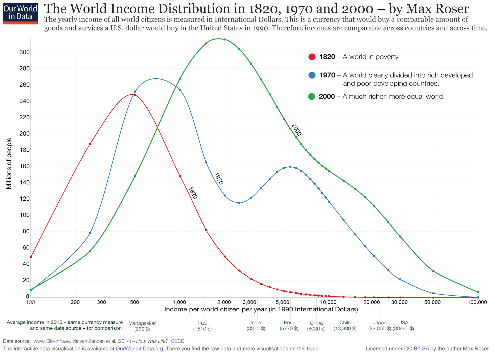
This is taken from Branko Milanovic (2010) – The Haves and the Have-Nots: A Brief and Idiosyncratic History of Global Inequality. Basic Books.
Note by the original source: ‘The graph shows that the income of the poorest 5 percent of Americans (country ventile 1 on the horizontal axis) situates them at the 68th percentile of world income distribution (see the horizontal broken line at level 68). The interpretation for all other points is the same.
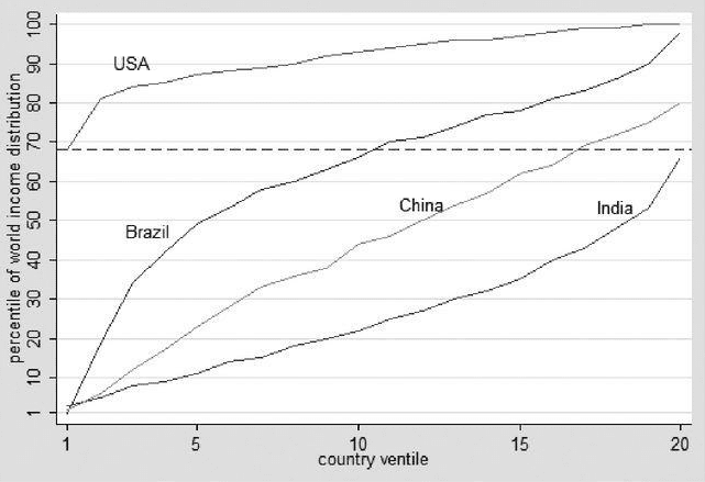
This is taken from Sala-i-Martin & Pinkovskiy (2010) – Parametric estimations of the world distribution of income (1970-2006). NBER Working Paper No. 15433


Brian Wang is a Futurist Thought Leader and a popular Science blogger with 1 million readers per month. His blog Nextbigfuture.com is ranked #1 Science News Blog. It covers many disruptive technology and trends including Space, Robotics, Artificial Intelligence, Medicine, Anti-aging Biotechnology, and Nanotechnology.
Known for identifying cutting edge technologies, he is currently a Co-Founder of a startup and fundraiser for high potential early-stage companies. He is the Head of Research for Allocations for deep technology investments and an Angel Investor at Space Angels.
A frequent speaker at corporations, he has been a TEDx speaker, a Singularity University speaker and guest at numerous interviews for radio and podcasts. He is open to public speaking and advising engagements.